A Strategic Shift
Product.ai was in the middle of a strategic shift. We had built one of the largest coupon verification engines through SimplyCodes, and we were expanding our mission beyond coupon codes toward verified product and commerce intelligence.
One of the clearest places this shift showed up was in our merchant landing pages. These pages needed to do more than list promo codes. They needed to support richer savings intelligence, more modular content, stronger brand expression, and eventually a programmatic page system that could adapt to different merchants and merchant categories.
At the same time, the company was becoming more AI-native in how it worked. We could generate UI quickly, but the results were not good enough to ship. Fonts, colors, spacing, hierarchy, and accessibility were inconsistent.
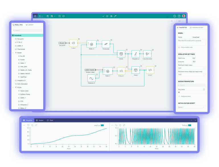
I designed and built a code-first design system that gave AI agents a more reliable way to generate usable, on-brand UI. The system combined semantic tokens, agent-readable context files, constrained CSS utilities, reusable components, page templates, and browser-based verification loops.
System Overview
-
dimension 1
Design Foundation
- Brand direction
- Base tokens
- Semantic layer
The system began with brand and product strategy rather than isolated UI components. The basic elements and rules for their use were generated from this.
-
dimension 2
Agent Operating Model
- Agent context
- Constrained utilities
In order to make this AI-native, I created context files, usage guidance, and pre-selected combinations of sizes, colors, and spacing encoded in CSS.
-
dimension 3
UI Generation System
- Generated mockups
- Extracted components
- Page templates
UI was generated in phases, starting with mockups to capture the overall feel and flow. These were refined, broken into components, and then page templates.
-
dimension 4
Quality and Output
- Browser verification
- Production UI
To ensure the rules were followed and quality standards were met, multiple automated checks were run. Issues were fixed at each step to avoid compounding.
A Page System, Not Just a Page Redesign
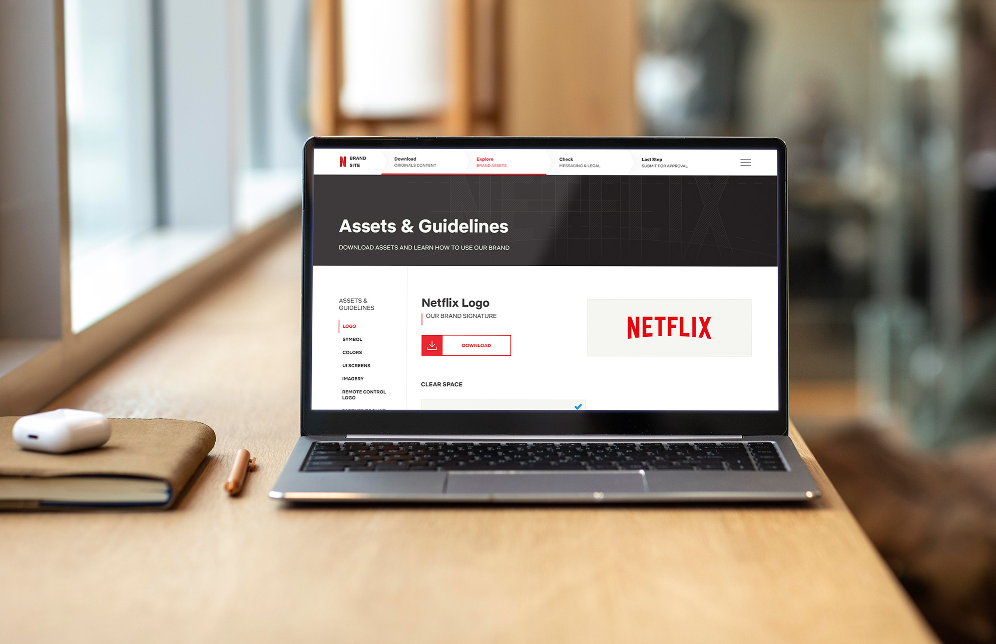
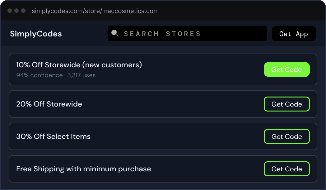
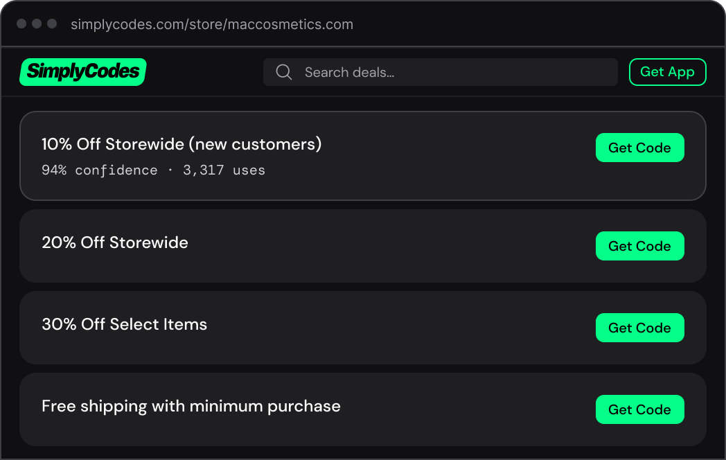
SimplyCodes merchant pages are the core surface of the product. A user lands on a page for a store and expects to quickly understand what codes are available, which ones work, what other savings options exist, and whether the information can be trusted.
Under the surface, the page is a collection of many smaller systems: merchant identity, verified promo codes, code success data, savings tips, alternate deals, trust signals, verification evidence, related merchants, and supporting SEO content.
Our CEO had wanted for a long time to make these pages more programmatic. Instead of designing one static page template, the goal was to create a modular system that could be recomposed by machine learning based on merchant type, available data, page performance, and user intent.
That meant the design problem was not simply "what should the new merchant page look like?" It was closer to: "how do we create a system where merchant pages can be generated, adapted, tested, and improved without sacrificing on user experience or brand fidelity?"
The Problem With AI Slop
Before this system, AI-generated UI was useful for getting a rough idea on the screen, but not much more than that. The output looked like whatever the model happened to produce in that session. Type sizes drifted. Spacing was arbitrary. Colors were close enough to seem plausible, but not close enough to be right. Low-contrast text was common. Buttons, cards, labels, and inputs were reinvented over and over again.
This was especially frustrating because the underlying idea was powerful. If an AI agent could turn product strategy into working UI, we could move much faster. But without constraints, the speed came at the cost of consistency, accessibility, and brand quality.
Before and After the Design System
Making the Design System Executable
I started thinking about the design system less as a Figma library and more as a set of instructions, constraints, and feedback loops that an AI agent could actually use.
The first layer was fairly traditional: base tokens. These included things like color scales, font names, spacing increments, border widths, radii, and other raw values. But the important layer was the semantic layer above that.
Instead of asking an agent to choose a hex value or decide what shade of green to use, the system gave it meaningful roles: surface, primary action, information, warning, card radius, button radius, label text, and so on.
This mattered for two reasons. First, it made the system easier to reason about. A semantic token describes intent, not just appearance. Second, it made theming safer. The base values could change underneath the semantic layer, but the relationships between foregrounds, backgrounds, surfaces, borders, and actions could remain usable and accessible.
The goal was not just to make the UI look more consistent. The goal was to make good choices the only choices.
Basic System Layers
Colors
Semantic aliases only
10% off storewide (new customers only)
Teaching the Agent
In a normal design system, documentation is written for designers and engineers. In this system, documentation also had to teach the agent.
I wrote context files that described how the design system worked, what the tokens meant, which utilities were allowed, how components should be structured, and what kinds of choices should be avoided. This became one of the most important parts of the system. If the files could be loaded into a coding environment, the agent had enough information to recreate the system at the required level of fidelity, even outside the original project environment.
The development environment was built around this idea. I used Claude Code, a structured directory of context files and libraries, and some custom skills and stop actions to automate repetitive checks. The first output was a set of universal CSS files: one for tokens, and another for the approved utility styles and combinations that generated UI was allowed to use.
Starting With Pages, Then Extracting Components
One decision that became important early on was not to start by designing every component in the abstract. The merchant page was too context-dependent for that. We needed to see how the page was working overall before deciding which parts deserved to become reusable components.
So the workflow started with full-page mockups. Product strategy, CEO concepts, and brand direction were turned into working page designs. I tightened those designs, made them responsive, improved accessibility, and resolved the interaction details. Once a mockup started to feel durable, I extracted components from it.
The components were organized into tiers. Atoms were the basic building blocks: labels, buttons, inputs, and simple text elements. Molecules were small combinations: cards, lists, status strips, code rows, and reusable content blocks. Organisms were larger sections: navigation, footers, modals, tabbed sections, and stateful page modules with multiple variants.
Several organisms were then combined into responsive page templates that took care of all the backend data connections, basic layout, and technical SEO concerns.
Exmaple Page Template
Custom Tools Tied It All Together
My first attempt at wrangling the complexity of the system was an inspector for design primitives. It let me load a mockup, click on an element, and inspect the design tokens underneath it, changing anything that needed fine tuning. It seemed promising, but it exposed the wrong level of abstraction. Sometimes it was too granular, other times it was too broad.
So I shifted from inspecting primitives to inspecting components. The next tool extracted components from a mockup, displayed their states and variants, and checked whether they were using the correct semantic tokens. This was more useful, but the editing and hot reloading were brittle.
My engineering lead then built a tool that tied several of these ideas together. It was clearly more powerful, but also harder to use. Component previews lived in a Shadow DOM, which meant styles did not always render the same way they would in the real page.
The breakthrough was removing most of the UI. Instead of building a complex editor, we created deterministic routes that rendered exactly what needed to be checked: one component, one page, or a grid of variants. Claude could open that route in a browser, inspect the rendered output, make changes, and verify the result. The less the tool tried to do, the more useful it became.
Custom Tool Evolution
Browser-Based Verification
The final piece was a browser-based verification loop. Before committing changes, the agent had to inspect the rendered UI one layer at a time. It would check colors, then typography, then spacing, then layout, then responsive behavior, and finally, it checked interactions.
This avoided the vague instruction to "make it look right." The agent had to focus on one aspect of the design at a time, compare it against the system, and then make corrections if needed.
That changed the role of QA. Instead of relying entirely on human review after the fact, the system pushed visual inspection into the generation workflow itself. It was not perfect, but it made the output much more stable and the agent needed much less hand-holding.
Browser-based Verification Loop
Launching Under Pressure
While this work was underway, Google changed its search ranking algorithm in a way that materially affected SimplyCodes traffic and revenue. Before the relaunch, revenue dropped by roughly 20%. That created pressure to move quickly, but not recklessly. We needed to ship improvements in phases, watch for show-stoppers, and keep making tactical adjustments.
Because the new system was already in place, we could move much faster than a traditional design-to-engineering handoff would have allowed. I was working directly in code, producing built outputs that engineering could connect to backend data. When data or API issues forced design changes, I could adjust the page quickly, or review alternate solutions from engineers without restarting the design process.
We launched a new version of the merchant pages, along with new landing page designs, within days. After the relaunch, the lost revenue recovered, and tactical edits contributed to additional week-over-week gains.
The Impact
Reflection
This project changed how I think about design systems. A traditional design system gives designers and engineers a shared set of reusable parts. That is still useful, but it is not enough for AI-native product development.
When agents are generating UI, the design system has to become more explicit. It needs semantic structure, usage rules, constraints, examples, and verification loops. It has to describe not only what the interface should look like, but how decisions should be made.
The biggest lesson was that AI does not eliminate the need for design judgment. It increases the need to encode that judgment clearly. The final system was not just a component library. It was a way to translate product strategy into usable interface structure, and to do it quickly enough to matter when the business needed to respond.